Personal Didactic Project
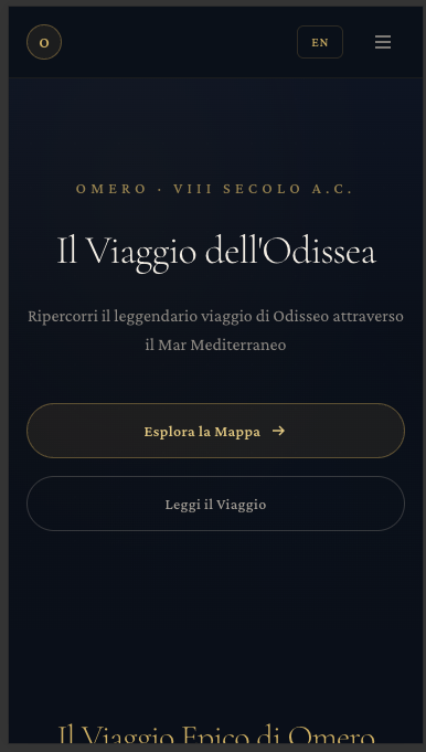
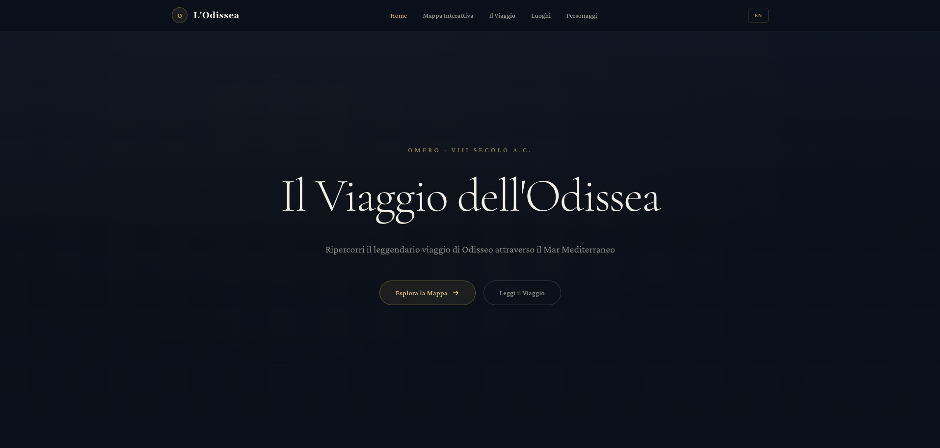
The Odyssey Journey
A bilingual editorial product that reimagines Homer's Odyssey as an interactive voyage: map, timeline, location pages, character profiles, narration, and SEO-ready learning paths.
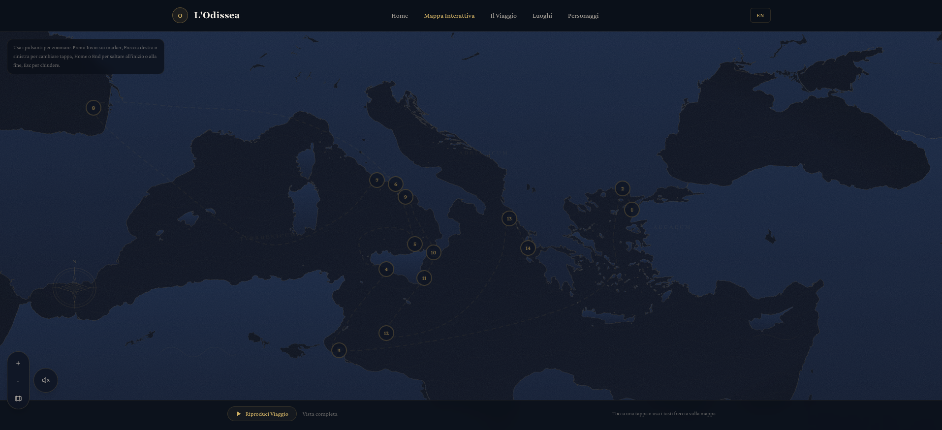
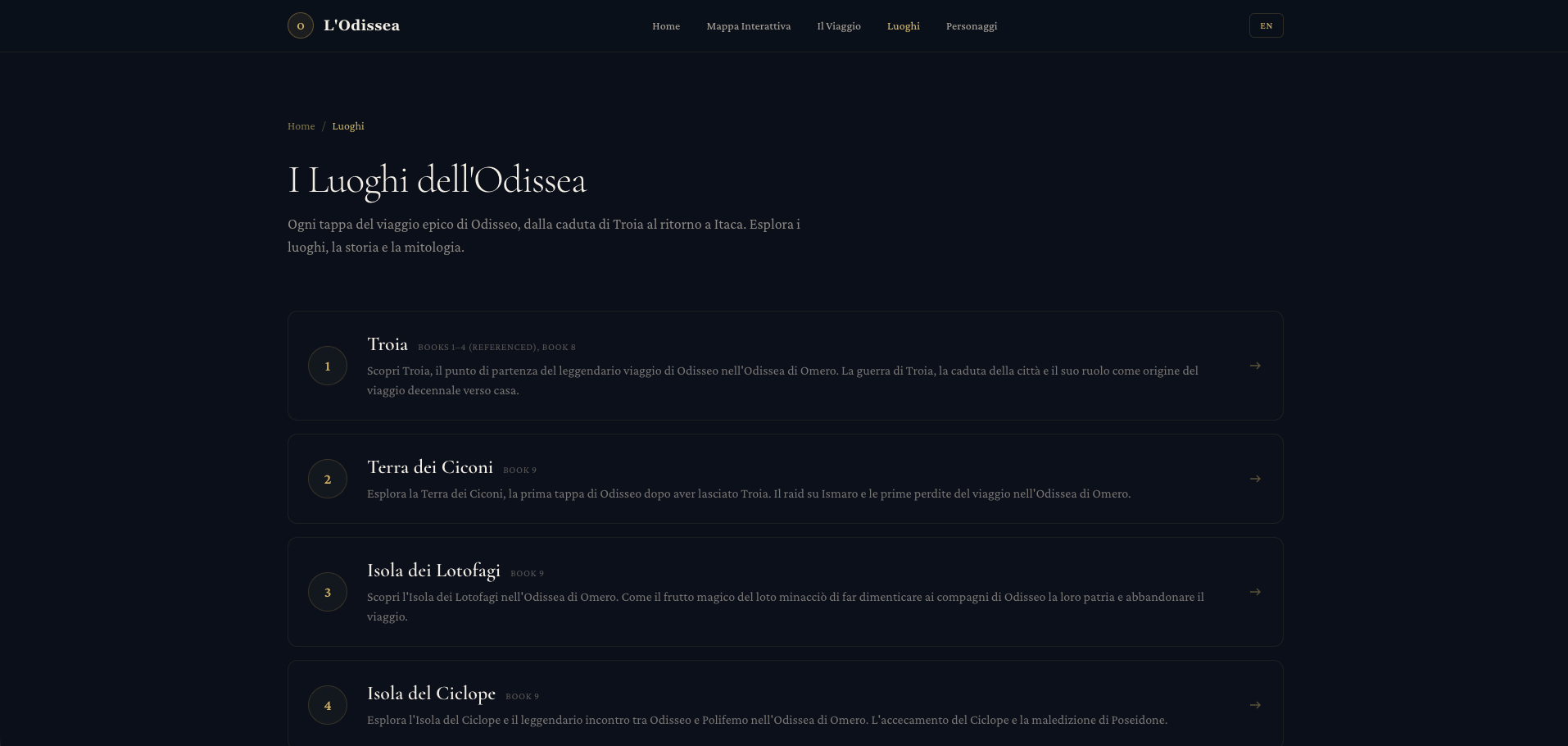
14
Journey Stops
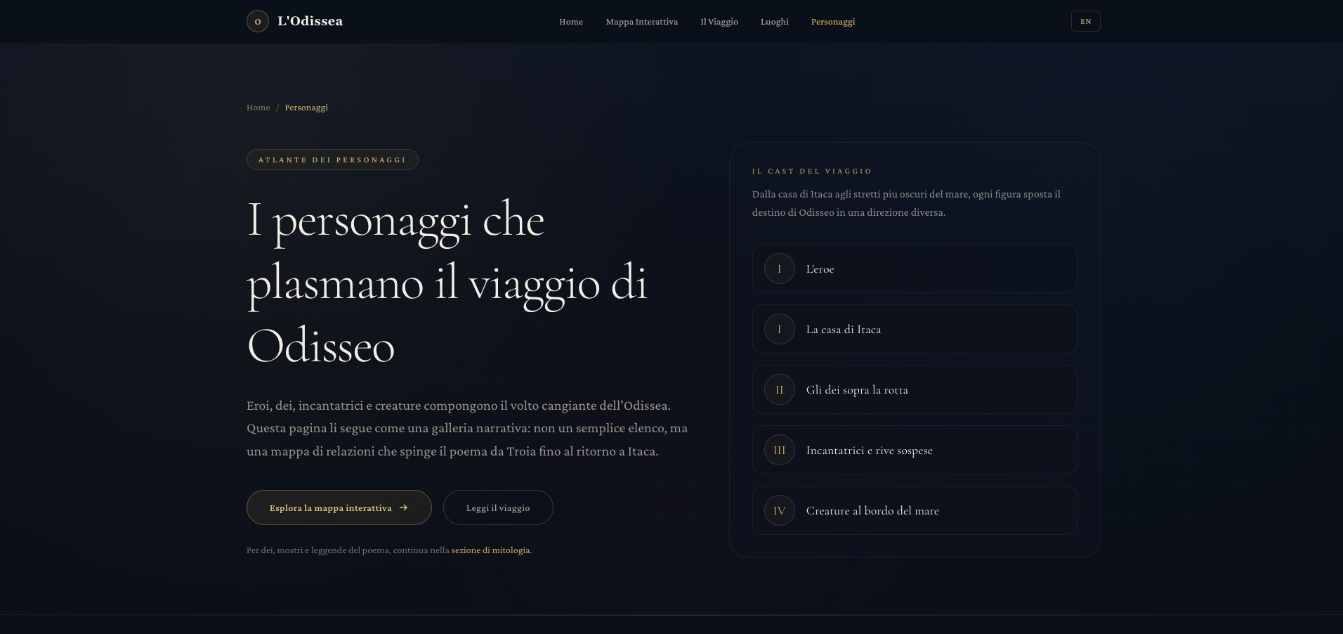
12
Character Profiles
2
Localized Languages
Handcrafted Map
Narrative Audio
EN / IT Routes